UTAS Home › › Mathematics Pathways › Pathways to Health Science › Module 10: Interpreting Tables and Graphs
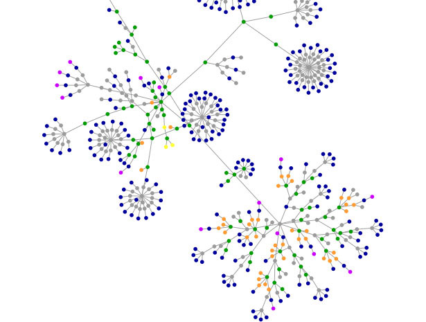 Tables and graphs are visual representations of data used to organise information to show patterns and relationships.
Researchers and scientists often use tables and graphs to report findings from their research.
More specifically, in a Health Science context, the first stage in the process of making evidence-based decisions is to collect accurate data and to describe, summarize, and present it for analysis.
Image: netdna.webdesignerdepot.com/uploads/visualization_tools/websites-as-graphs.jpg
The type of graph or table used to present data (variables) depends largely upon the types of variables involved. Therefore, it is important to understand how variables are classified.
Remember that a variable is any characteristic, number, or quantity that can be measured or counted.
A variable may also be called a 'data item'. You may also wish to work through (or review) section 2 of the Data and Statistics module, which also deals with the different variable types. In order to give an overview of the different variable types, it is appropriate to make the distinction between quantitative and qualitative variables. The following animation from the Australian Bureau of Statistics (ABS) explains what quantitative and qualitative data are. Note that there is no audio with this animation.
Qualitative variables are those that express a qualitative attribute such as eye colour, religion, gender, and so on. The values of a qualitative variable do not imply a numerical ordering. Values of the variable "religion" differ qualitatively; no ordering of religions is implied.
Qualitative variables are sometimes referred to as categorical variables. Quantitative variables are those variables that are measured in terms of numbers. Some examples of quantitative variables are height, weight, and shoe size.
It is also important to address the distinction between discrete and continuous variables. Variables such as number of children in a household are called discrete variables since the possible scores are discrete points on the scale. For example, a household could have three children or six children, but not 4.53 children. Other variables such as "time to respond to a question" are continuous variables since the scale is continuous and not made up of discrete steps. The response time could be 1.64 seconds, or it could be 1.64237123922121 seconds. Of course, the practicalities of measurement (i.e., there is no such thing as an infinitely precise and accurate measuring instrument) preclude most measured variables from being truly continuous.
Practice questions
A Mass measured in kilograms
B the number of apple varieties sold
C The number of days it rained
D Hair colour
E Average daily temperature
F Apple variety
G Height measured in metres
Click here to check your answers
Notice in table 1 below, qualitative variables may also be called categorical variables and quantitative variables may also be called numeric variables.
Table 1: Classification of variables
| |||||||||
This table was adapted from a similar version from the following link:
http://www.abs.gov.au/websitedbs/CaSHome.nsf/Home/CaSQ+3B+NUMERICAL+DATA:+WHAT'S+
Numerical summaries for discrete variables: frequency distribution tables
Especially in the health sciences, where data is often collected from a large number of measurements or subjects, an efficient way of representing the data is to display it in a frequency distribution table, and they can be used for both categorical (qualitative) and numeric (quantitative) data. The following link to 'Statistics Canada' explains the terminology associated with frequency distribution tables, as well as how to construct and interpret such a table. Please click on the link below and work through the set examples.
The next link explains how frequency distribution tables are a common and useful way of summarizing discrete variables in a health science context. Please click on the link and go straight to page 3 (you will find page numbers at the top left hand side of the webpage). Read through the section on "Numerical summaries for discrete variables" and complete the short answer "self check" question towards the end of the page.
A stem and leaf plot, or stem plot, is a technique used to classify either discrete or continuous variables. A stem and leaf plot is used to organize data as they are collected. The following link to 'Statistics Canada' gives an overview of the features of a stem and leaf plot, and how they are constructed and interpreted. Please click on the link and work through the set examples.
Practice examples involving data types, frequency distribution tables and stem plots
You will find a set of ten questions by clicking on the link below from Statistics Canada. Although you will also notice that there are an extra 4 "class activities", you are only expected to complete the 10 multiple choice items.
A box-and-whisker plot can be useful for handling many data values. They allow people to explore data and to draw informal conclusions when two or more variables are present. The concepts and skills associated with statistics such as the median are covered more extensively in the Data and Statistics module. The purpose of this section however, is to familiarise you with the way data are represented in a box plot and how to interpret them. Five-number summary is another name for the visual representations of the box-and-whisker plot. The five-number summary consists of the median, the quartiles, and the smallest and greatest values in the distribution. Immediate visuals of a box-and-whisker plot are the centre, the spread, and the overall range of distribution. The following youtube video provides a useful explanation of what is meant by a five-number (or five point) summary, how to construct, and how to interpret a box plot.
The 'mathsisfun' link below, provides a brief overview of box plots and the associated terminology, followed by ten practice questions.
It is often useful to describe variables as either dependent or independent.
The dependent variables are what can be seen to be changing in relation to the particular levels of the independent variables.
The independent variable in an experiment or investigation is that variable that is deliberately controlled or manipulated by the investigator.
The dependent variable is the variable that responds to changes in the independent variable.
Example
An experiment to test the effects of a particular fertilizer on plant growth, could measure a number of things including height, number of fruit, average weight of each fruit produced.
All of these factors are analysable and arise from the manipulation of one independent variable, the amount of fertilizer.
Note: The term 'independent variable' is sometimes misunderstood because some people assume that the name means that the variable is independent of any manipulation. Rather it is called the independent variable because it is isolated from any other factors, allowing experimental manipulation to establish results that can be analysed.
Practice examples:
In each of the following examples, state which of the two variables you would consider to be the dependent variable and which would be the independent variable.
Click here to check your answers
Bar graphs should be used for categorical, ordinal, and discrete variables. They are particularly useful for representing ordinal data. The following link to the Australian Bureau of Statistics gives an overview of the different graphs types and how they should be used. Please click on the link below and read through the section on bar graphs, column graphs, and horizontal bar charts.
Pie graphs (sometimes called pie or circle
charts) are a useful way to represent
nominal data. They can be used to compare the size of relative parts that make
up a whole. For example in the pie chart below the 'whole' is Kapuni Natural
gas which has been divided up into the relative proportions of its constituent
gases.
Because it is difficult to compare different circle graphs, and often hard to
compare the angles of different sectors of the pie, it is sometimes better to
choose other sorts of graphs.
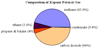
Image: http://arb.nzcer.org.nz/strategies/images/graph1.gif
The following link to 'Statistics Canada' provides further discussion about the purpose and appropriate use of pie charts, including a comparison to bar graphs. Please click on the link below and read through information on pie charts.
Histograms
are similar in some respects to bar graphs but there are some important
distinctions. A histogram has a similar appearance to a column graph but there
are no gaps between the columns. It is used to depict data from the measurement
of a continuous variable.
Technically, the difference between column graphs and histograms is that:
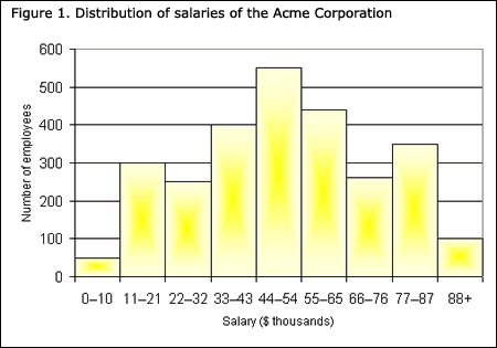
Image: www.statcan.gc.ca/edu/power-pouvoir/ch9/img/5214822_01-eng.jpg
Generally, a histogram will have equal width bars, although
when class intervals vary in size this will not be the case. The next
weblink to 'Mathsisfun' explains how a histogram may be constructed and
interpreted. Please click on the link, read through the webpage and complete
the ten accompanying practice questions at the end.
Line graphs provide an excellent way to map independent and dependent variables that are both quantitative. A line graph is a very common way of presenting statistics. It is particularly useful when you want to display information over a time period. For example, the line graph below shows the trend in sales at a particular shop over a period of one month. It is important when drawing a line graph that you use the correct scale otherwise the line's shape can give an incorrect impression about information
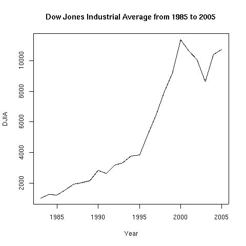
Image: hwachongilp.wikispaces.com/file/view/line-graph-1.jpg/148664353/line-graph-1.jpg
The following link to Statistics Canada, provides a comprehensive explanation of the structure and purpose of line graphs. Please click on the link below and read through the information on line graphs.
A scatter plot is a useful way to graph the data formed when a relationship exists between two variables. Such data is called bivariate data.
Scatter plots are similar to line graphs in that each data point is specified by both an x coordinate (independent variable, also called the explanatory variable) and a corresponding y-coordinate (dependent variable also called the response variable).
The important distinction however, between scatter plots and line graphs is that in a scatter plot the individual points should not be connected directly together (such as in a 'join the dots' puzzle), but rather they express a trend.
This trend can be seen directly through the distribution of points and or with the addition of a regression line which you may be familiar with as "the line of best fit". The skills and concepts associated with understanding regression are dealt with in more detail in the Extension section of this module.
The scatterplot below indicates that the amount of sleep needed per day decreases during the first 20 years of life decreases with age.. In other words, there is a negative correlation between age and hours of sleep required per day up until the age of 20. Correlation tells us something about the strength and the direction of the relationship between the variables, and this will be discussed shortly.
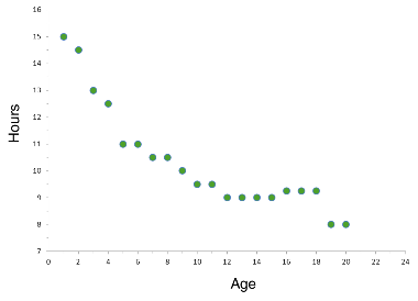
Image: www.shmoop.com/basic-statistics-probability/scatter-plots-correlation-examples.html
Correlation and causation between variables do not mean the same thing.
Before we discuss correlation further, it is important to understand that just because there may be a correlation between two variables this does not necessarily mean that one variable causes another. A correlation can be explained in four broad ways:
The following animation from the Australian Bureau of Statistics explains the distinction between correlation and causation, and why it is important to understand this distinction.
Linear statistical correlation is measured by the Pearson correlation coefficient (r) which can take on numerical values ranging from +1.0 to -1.0.
The Pearson correlation coefficient gives an indication of the strength and direction of the linear relationship (if any) between two variables. In general if the correlation coefficient r is greater than zero this indicates a positive relationship and if r is less than zero this indicates a negative relationship between the variables.
If the correlation coefficient, r, is equal to zero this indicates that there is no linear relationship between the variables. The closer the value of r is to +1 or -1, the greater the strength of the relationship as indicated in by the scatterplots shown below. Note the value of r (the Pearson correlation coefficient) for each scatterplot.
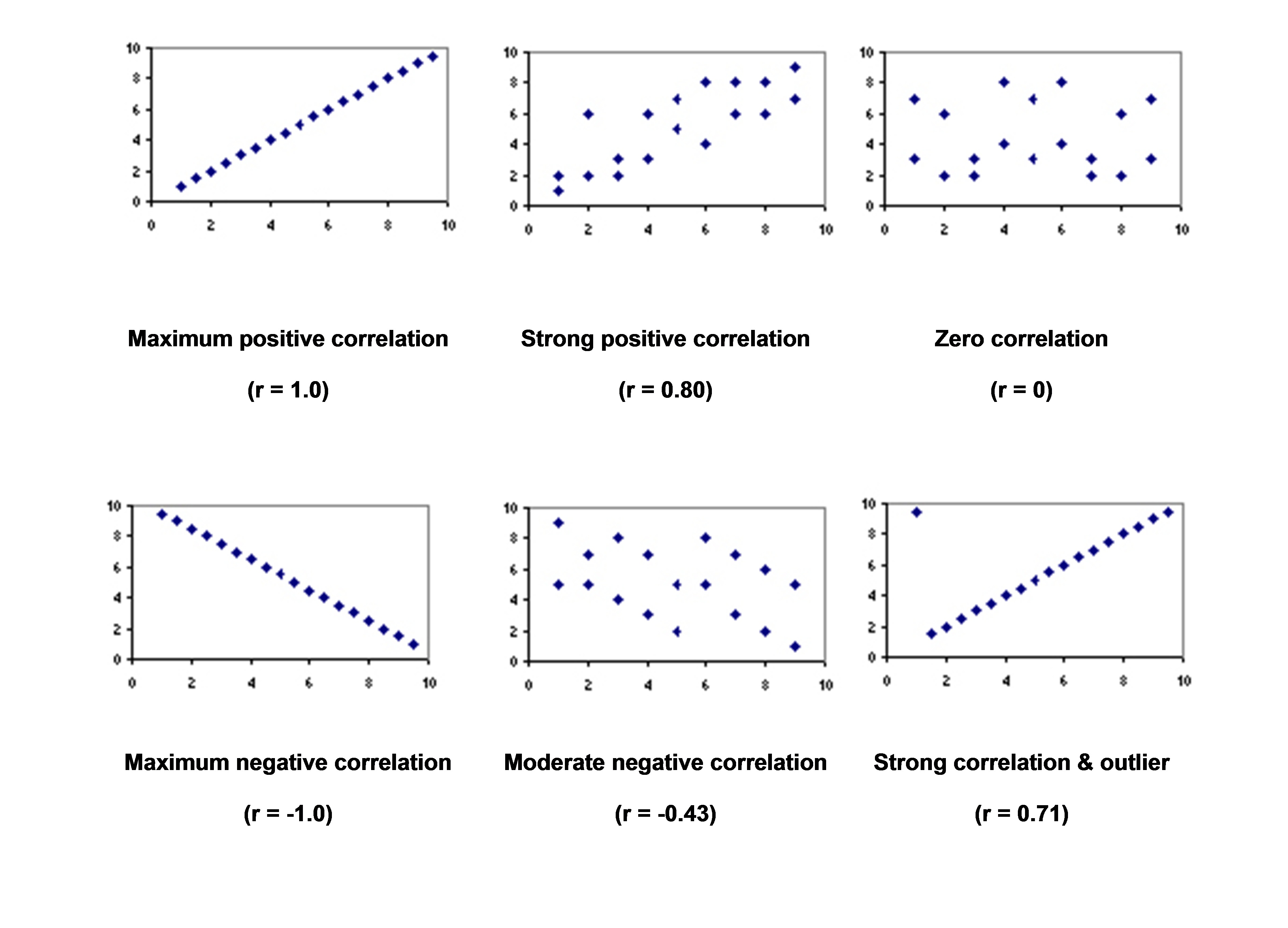
Image: rsgcserevision.weebly.com/uploads/2/1/7/0/21709860/5784960_orig.jpg
Examples
Click on the link below from Boston University School of Public Health and go straight to page 2 (links to the page numbers can be found in the top left hand corner of the page. Read through the information on correlation analysis and complete the accompanying quiz question.
The line of best fit (sometimes called the trend line), is a straight line drawn on a scatterplot which best indicates the linear relationship between the variables. There are several methods of finding the equation of the line of best fit, including by eye, the regression method (method of least squares), and with the aid of technology such as a CAS calculator. The process of finding the line of best fit is dealt with in more detail in the extension section at the end of this module.
Predictions of the level of one variable given the level of the other variable can be made from both the scatter plot and the equation which represents the relationship between the variables (i.e., the line of best fit).
If the prediction involves values which fall within the bounds of the original experimental data the process is called interpolation.
If the prediction involves values which fall outside the bounds of the original experimental data the process is called extrapolation.
It is important to note that predictions cannot be considered reliable if they are made through the process of extrapolation as this would be assuming that the particular linear relationship continues for untested values. Please click on the following Math Is Fun - Maths Resources link for further explanation in relation to interpolation and extrapolation. You will also find links to 12 practice questions.
A misleading graph is a graph which misrepresents data so that incorrect conclusions may be derived from it. Graphs may be misleading through being excessively complex or poorly constructed. Even when well-constructed to accurately display the characteristics of their data, graphs can be subject to different interpretation.
Misleading graphs may be created intentionally to hinder the proper interpretation of data, but can be also created accidentally by users for a variety of reasons including unfamiliarity with the graphing software, the misinterpretation of the data, or because the data cannot be accurately conveyed.
Please click on the following links to find out more about how to recognise misleading data.
2. The following link from www.forbes.com describes why a series of graphs relating to patient patient experience measures from the Hospital of Special Surgery.
Extension - continue to challenge yourself
Extension
The trendline is the line of best fit for the data points. The trendline itself does not tell us how good the 'fit' is. Generally if the data points are close to the line, the fit is good and if the data is widely spread out from the line the fit is not very good. For example the data points in the graph below are relatively close to the trend line. The trend line shows the most likely relationship between the variables x and y, in the case of the graph below, the x variable is the number of hours of exercise and the y variable is the resting heart rate.
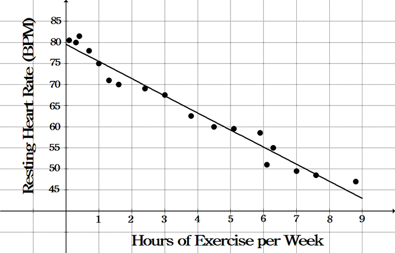
Image: mistertmath.weebly.com/uploads/2/8/5/0/28500815/sp_7.3.pdf[NM1]
The trendline equation is of the form y = mx + c where,
The following link to Math Is Fun - Maths Resources, deals with this general form of a linear function.
Interpretation of the trendline
To find the best estimate of y for any given x, plug x into the trendline equation
m is the effect on y of incrementing x (adding 1 to x)
c is the value of y when x = 0
Before completing the following practice example, you may wish to revisit one of the Math Is Fun - Maths Resources links that provides an overview of scatter graphs and trend lines as well as an example showing how the general form of a linear equation may be used to find the trend line (line of best fit).
Example
This example relates to the graph above showing the relationship between the number of hours of exercise per week and resting heart rate. Given that the trendline is given by the equation:
y = -4x + 79
An alternative presentation of the equation could be:
RHR = -4*(Ex) +79 because is appropriate to use symbols that relate to the variables in question as opposed to always using symbols x and y. Therefore you will notice that the equation has been rewritten in terms of RHR (resting heart rate) and Ex (weekly exercise). This particular form of the equation is in the context of a calculation performed using an Excel spreadsheet)
Click here to check your answers
As mentioned previously, correlation coefficients measure the strength of the correlation between the variables.
There are different types of correlation coefficients depending on the type of data. In this module we have dealt only with linear regression and therefore the Pearson Correlation coefficient.
For more on the Pearson correlation coefficient and how it is calculated, please click on the following Math Is Fun - Maths Resources link and read through the explanations and complete the accompanying quiz questions.
Authorised by the Director, Centre for University Pathways and Partnership
13 April, 2022
Future Students | International Students | Postgraduate Students | Current Students
© University of Tasmania, Australia ABN 30 764 374 782 CRICOS Provider Code 00586B
Copyright | Privacy | Disclaimer | Web Accessibility | Site Feedback | Info line 13 8827 (13 UTAS)